Toronto, Canada
Hello,
I'm Isobel
In 2021 I ventured into the fascinating world of UI & UX design with the help of a mentor.
This is a showcase of that project!
This is a showcase of that project!
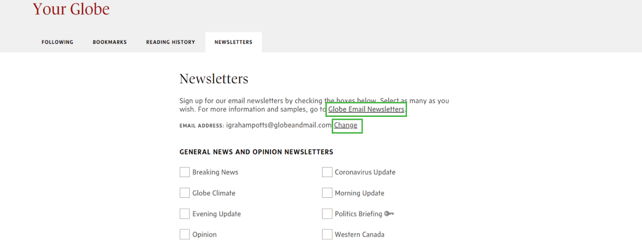
Reimagine the user flow of the Globe and Mail newsletters page to allow users to change or add additional email addresses to their newsletter subscription preferences.

Product designer
3 months
The product design team at the Globe and Mail learned from user interviews that a common pain point for newsletter subscribers is the user's desire to change the email address that their newsletters are sent to.
This project was intended to explore how the user flow of the Globe and Mail website can be modified to enable newsletter subscribers to receive newsletters to the email address(es) of their choice.
I began with a kickoff call discussing the brief, scope and desired outcomes with project stakeholders.
From this discussion I learned the user context informing the project's key assumptions and identified several important use cases to test my design against. I used this information as a rational for making my design decisions.
I mapped the user flow and identified current pain points: primarily overly-varied and unpredictable navigation structures.
I reviewed the Globe and Mail's pattern library and familiarized myself with the Globe's various styles and UI components.
I created a new user flow using current design patterns and page structures to stay within the scope of the project. To do this I made changes to two separate sections of the website: modifying the cards on the Newsletters page and adding a new section to the Account Settings page.


The 'Add Email Address' option on the Newsletters page redirected the user to their Account Settings, where they could leverage the new 'My Newsletter Email' section to add a preferred email address.
Having added any/all additional email addresses in Account Settings the user could then select them on the Newsletters page moving forwards, or customize newsletter selection on the 'My Globe' > 'Newsletters' tab by clicking 'customize newsletter preferences'.
While creating this option I asked is it too much set-up and would it be too complex or time consuming for the average user?
No major system changes.
Starting a process on one page and redirecting to another removes the user from their original intent.
Find ways to achieve the outcome without redirecting the user away from the Newsletters page.
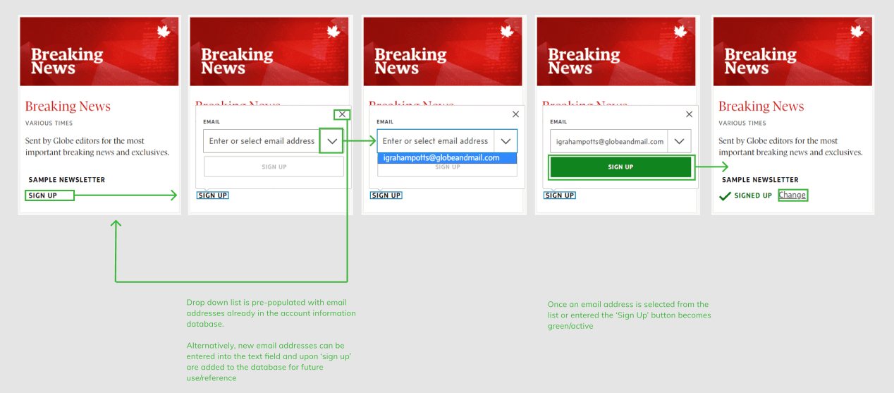
I looked into alternative ways to fit the email address selection and creation toggle onto the Newsletters page. Possible options included cascading cards, drop down menus, expanded states and flyout widgets.
I searched other design systems for examples of my the functionality, as well as for preexisting samples within TGAM. I found a sample suitable for my purposes on the Globe and Mail's Podcast page, which I then modified for my own purposes.


This idea was a fusion of found functionality from an external design system and TGAM’s visual style, leveraging the design of the Podcast page cards in combination with the smooth transitions of the expanding cards in the Material Design system.
Round 3 began very much the same way as round 2: search for a way to present the user with the space to add or modify a new email address while remaining on the Newsletters webpage.
Returning to The Globe and Mail website I searched again for any samples of flyout or pop-out functionality which would be within the technical limitations of the website. The Podcasts page featured flyout functionality that I then leveraged for my next design iteration.
The structure of the Newsletter’s page didn’t allow for the smooth expanding functionality as designed without a large amount of redevelopment and so in this round I ended up going beyond the project's scope.
After completing round 3 with functionality I knew to be within the project's scope and website's capabilities I felt confident about my design and moved to test it against two of the use cases:
A first time newsletter user signing up to Top Business Headlines: Evening Edition and adding a new email address.
A user who is already subscribed to 2 newsletters and wants the Politics Briefing newsletter to go to a separate email address to the Report on Small Business newsletter
After testing against these two use cases I found that my design did not stand up under more rigorous user testing.
The proposed flow functioned well for Use Case #1, but led to a series of user redirections that did not return the reader to their original point of website interaction in Use Case #2, repeating the issues found in round 1 of the design.
The final round of my design was dedicated to closing loops in the user flow, minimizing redirects and curating the language of new copy to be simple and plain, removing unnecessary verbosity.
I weighed these changes against the project's identified use cases and desired outcomes and was satisfied with the outcome.


Had it been within scope this user flow would benefit from a complete re-design of the Newsletter’s page or a redevelopment of the back-end to allow the cards to cascade dynamically, allowing for greater functionality options and mobile-first user interface solutions.
This project was a brilliant design challenge. It represented a real issue that the Globe and Mail's users come across and required me to consider how front-end data collection could be made smooth and frictionless for our users on a part of the website that is not designed for data input (the newsletters page).
Had I the chance to do it again I would use my lessons learned and a conversation with the devs to redefine the project's scope and use brainstorming and storyboarding to refine my design concepts before creating further design iterations.

